www.ABCmarket.com
This was the first project I completed at Ironhack Miami’s design boot camp. I worked closely with my partner and fellow UXer, Sandra. The challenge was to assist a leading regional supermarket in entering the digital marketplace. After conducting early research, we decided to create a website rather than a mobile app since that’s where almost everyone shopped for online groceries.
It was very important that we found a way to translate the “neighborhood shopping environment” and premium services that they offer in-store into our new digital product. We did this in many ways. Firstly, our website was designed to be as smooth and quick as possible. We know our customers hate spending time searching for specific items or worse… realizing they can’t buy the last key ingredient on their shopping list because it is not sold there or out of stock. This was a frustration that shoppers repeatedly expressed and that we kept in mind when designing our key feature.
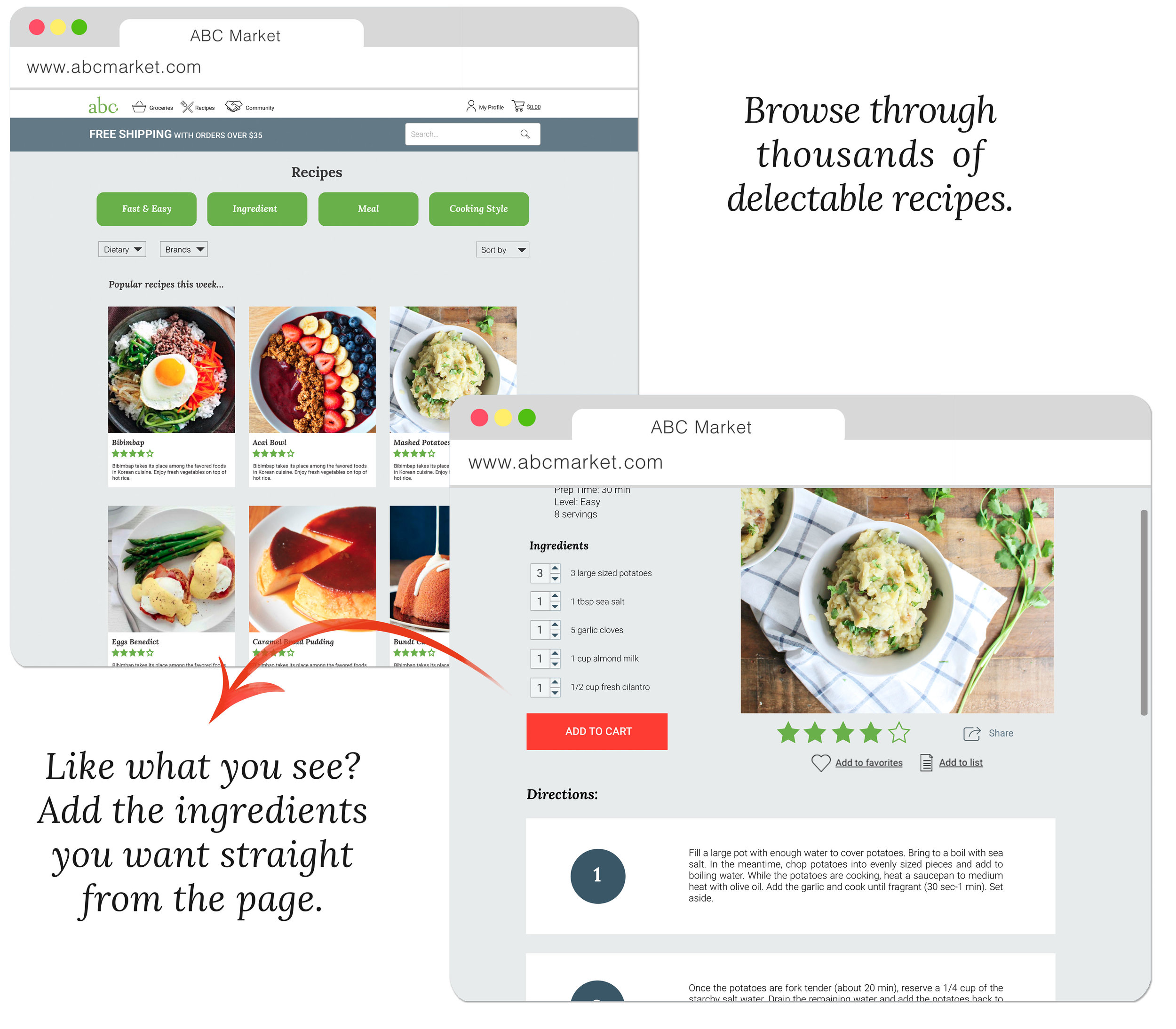
We also wanted to promote community with our new website, so we offer visitors some of our favorite tasty recipes on the homepage, give them the ability to submit their own, and continuously promote events in the area as well. To learn more about my whole research and design process, check out my case study below. ⬇️ ⬇️ ⬇️
A Case Study
Summary
Client: ABC Market, a fictitious company. They are a premium, local grocery store with an established audience.
Challenge: Adapt ABC’s existing luxurious shopping experience into a digital one
Time limit: 2 weeks (1 for research, 1 for visual and prototypes)
Solution: Website that lets customers easily find items based on an organization system that mimics aisles and also lets them add individual ingredients directly from recipe pages
Defining Success
Before researching and designing, we first decided on business metrics that would determine if our new platform was a success or failure. Looking at sales revenue, the amount of new online accounts being created, the number of daily visitors, the amount of time users spend to complete tasks, and feedback from interviews would let us know if things were going well. We can look at churn rate and incomplete transactions to give us an idea if there are any unforeseen blockers that are preventing customers from completing a goal.
Research
We needed to ask ourselves some basic questions to find out what we already knew regarding grocery shopping and to see what we needed to find out (through surveys and interviews). The company provided us with some quantitative data that they had completed themselves, but the data was a few years old so it was important that we gather more.
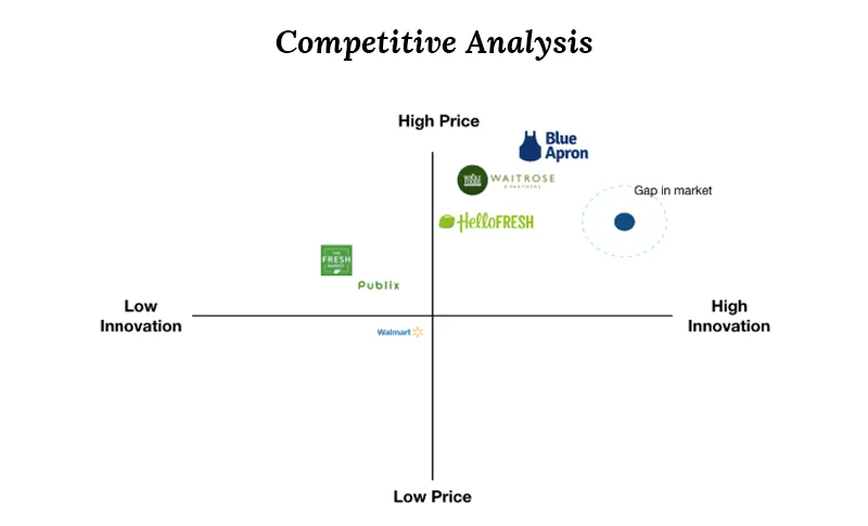
Before going out to learn more about our users, we also drafted a list of grocery stores that we thought could be considered ABC Market’s competitors. We made both a Feature Comparison table as well as a Competitive Analysis graph to better understand our place in the digital landscape. It seemed to us that there was an opportunity for ABC Market to shine if they could implement innovative, helpful features on their digital platform. Many competitors’ sites were far from cutting edge.
Drafting survey and interview questions was challenging for my teammates and me since it was our first time. We tried to mainly learn more about their current frustrations and motivations regarding grocery shopping as well as gain a better understanding of their lifestyle habits. In total, we had 91 survey responses and 11 interviews.
We created an Affinity Diagram to make sense of all of our findings. The purpose of the Affinity Diagram is to organize user feedback and try to search for trends that might have been alluded to but never explicitly stated.
Research Insights
We identified the following 3 main pain points as the most typical stressors for people.
Customers hate when grocery shopping takes longer than they expected.
Customers get very annoyed when they can’t find specific items they have in mind.
Physically moving heavy grocery bags from the checkout to the fridge is a big bummer.
We also learned that the main blocker or reason why people do not order groceries online is because they are worried about the quality of the produce that will be selected for them by a stranger. We didn’t really consider this a pain point since it is not a low point on their current customer journey. Many interviewees admitted that this was not a totally rational fear and that they might consider ordering groceries online in the future, but they prefer not to at the moment. One woman explained that she has only used a grocery delivery service when she absolutely has to due to her schedule being completely full— only then can someone else choose which bananas she will eat that week.
Another commonly expressed frustration revolved around not being able to find specific items easily, sometimes because aisles were rearranged. We talked to shoppers who told us stories about looking for an item required for a recipe for a long time only to realize that they could not complete that recipe because one of the key ingredients they looked for at the end was out of stock.
Our third notable frustration dealt with the exhausting task of transporting heavy bags from the checkout to your refrigerator. We spoke to one woman that told us a story about how she had to go up and down the stairs of her apartment complex three times in order to take everything out of her trunk.
Conversely, we found that people were motivated and excited to shop through high quality fresh food and discounted prices. We also had the audio recording of a representative from ABC speaking to a young man. He described his idea for an ideal online shopping experience. He thought it would be great if you could select your personal shopper, and this was an idea that we considered for a long time.
Using all of the data that we collected, we created a user persona to represent the majority of our target audience. This process also helped us to better empathize with our users and better understand the pain points that they face. Our user persona is Alex the type-A assistant. She is in her early 30s, has a husband, works full-time, goes to the gym, and tries her best to maintain a healthy social life. She is conscious of both her health and her savings, so she grocery shops about once a week. She usually buys the same things every week but sometimes tries cooking recipes that she discovered and bookmarked on Instagram.
Her user journey helps us to better understand the before, during, and after for Alex and how she interacts with grocery shopping. We can see on the user journey that she is frustrated at the store when she cannot find items that she likes and we can see a big boost when she discovers that wine is being sold at a discounted price. Looking at the low points in her use her journey, we ask ourselves: how might we help Alex during these moments?
Ideation & Prototyping
Since we had a better understanding of our users’ main problems, we dove into brainstorming possible solutions, which is also known as ideation. We played a fun game where we considered the least realistic/most ridiculous solutions we could come up with as an exercise to let our guards down and think more broadly. Of course, we also put forth ideas that we thought made sense.
The idea is to get the idea out as soon as possible so that the next idea can come. Here are the ideas we came up with as a team.
Then we began organizing these ideas based on their impact and level of effort required to implement them. This is known as the Moscow method and it helped us to determine our minimum viable product, MVP. At this time we expected to make a feature to help online customers select their own personal shopper.
Quick recap: we were trying to address their 3 biggest pain points when choosing our MVP. They could save time shopping online because there are no inexperienced cashiers or long lines. They wouldn’t have to carry heavy grocery bags because they are delivered. They could easily find items by using the prominent search bars. This could work, right? We got started on the organization of our website.
We then created our low-fidelity paper prototype to test with users. We created screens that resembled a computer as opposed to one that’s shaped like a smart phone. This is because we learned that most people have only ever tried grocery shopping online with a computer. My team and everyone reading this knows there are people out there that order groceries with their phone, but our research told us that it is happening much more often on computers. We decided designing a website should come before creating a smartphone app.
User testing revealed that selecting a personal shopper was not a valued feature.
Time To Pivot
With our low-fidelity testing came a significant “pivot” moment. We learned that the idea of letting customers choose their own personal shoppers was not testing well. This idea first came from an interviewee and we thought it had potential as well. However, after testing this personal shopper feature with users, we found that they were confused and not that excited by having the option to choose their shoppers. Furthermore, my teammates and I were a little concerned about racial profiling playing a part when customers chose their personal shopper. It seems that in the end, customers still felt like they were letting a stranger select their fresh produce and the fear they had about having gross fruits or vegetables being delivered to them was hardly relieved at all, so we shot and missed.
At this point we were back to brainstorming and still needed a new key feature that could separate ABC Market from similar online grocery platforms. We focused on the frustration regarding not being able to easily find items. We came up with a feature that lets customers add ingredients from different ABC recipe pages without needing to leave the page at all. When we first thought of this, we were surprised online markets are not already doing this. We double checked and sure enough: basically none of the competitors that we analyzed were doing this. Additionally, we let customers easily edit the quantity of the items being added to their cart in case they wanted to make this recipe for twice the amount of people or in case they already had basic items like garlic or salt and didn’t want to purchase more.
100%
We tested our new idea with mid-fidelity screens and 100% of users easily navigated through our prototype with no issues or confusion. We were ready to move on to high-fidelity screens now.
UI Design
Before designing the ABC website screens on Sketch, we began the UI (User Interface) process by creating a mood board containing images, colors, and typefaces that inspired us. Our 3 brand attributes were: fresh, high-quality, and communal. Our first attempt at a mood board did not test well. Our test results indicated that the look was way too feminine, although it did give off an expensive feeling. Thus, we created a second mood board, retested, and we were happy to find out that users were giving us feedback very similar to our 3 brand attributes. Success!
Since I have a marketing, graphic design background I put a lot of thought into the new logo for ABC Market. I really wanted it to stand out from other supermarkets. As you can see from my sketches below, I also kept on trying to incorporate different foods into the design.
Different ideas i had and sketched for the new ABC logo
When I thought about fancy grocery stores that I’ve been to vs. the cheapy ones I’ve also been to, I decided that one of the main differences is the part of the store where the hot or prepared food is offered. In grocery stores that provide for low-income shoppers, this part is smaller since shoppers know these kinds of purchases aren’t good for their budgets. However, in very posh grocery stores this section is huge and filled with hors d'oeuvres as if you could buy a platter for a party.
This is why I thought using an olive was a classy idea. First of all, it’s associated with martinis (expensive), European/Spanish old-word charm, and it’s the type of high-end finger food that would only be offered at a nice prepared-food section. Here are some vector sketches I created.
These olive ideas ended up being a flop. Testers thought that these logos represented a fancy wine store or even high-end catering, which was pretty off from my intention .
As much as I wanted to incorporate some kind of food item to make my logo more unique, people’s mental models were telling them that this logo represented a store with a specialized selection. This was really dangerous because I didn’t want to lose any possible shoppers that thought they couldn’t buy general groceries here. I needed a more basic logo, so I went with another one of my sketched ideas (above). This logo was meant to represent a stamped/weathered look. I liked this idea because it felt artisanal and made ABC Market look local, traditional, and trustworthy.
When I tested the redesigned logos, test results were looking great. People thought the logo was expensive-looking and like a “nice place to buy groceries in Brooklyn”, which was a good thing for our brand! My next step was to create a style guide.
Setting Standards
We then created a style guide for ABC Market, which included things like how a button would look, the design elements of our site, examples of icon styles, etc. This would serve as a compass for designers in the future to understand which direction to go in when creating new materials for ABC Market.
Since this was our first time ever creating a website, we had a lot of challenges. The one that stood out the most was in regards to oversized images and text. Since we were designing screens on Sketch but not viewing them at 100% we had everything too large. We had to go back and make everything smaller and smaller. Although it felt uncomfortable to make certain elements so little, we had to keep in mind that our users are used to these sizes and we should make designs based on their existing mental models.
Our ability to manage space within the webpage dramatically improved over the course of this project. I was designing things MUCH larger than they needed to be for users to see clearly. Lesson learned!
Positive Feedback 💯
User testing with our high-fidelity screens was very successful. Users thought the website looked polished and professional. They also thought being able to ingredients to their cart directly from recipe pages was a great idea that made a lot of sense. Most of them were surprised that this hadn’t been a feature already.
Video Demonstration
Here is an example of a transaction that can be completed with the new ABC website.
We also designed a few error screens that could be used for the real site. It’s important for designers to not forget to design for user mistakes.
This is how I imagine a future (Android) app would look like, based off of our website design.
Conclusion & Next Steps
Looking back at everything we accomplished with this project, I know a learned a ton. I did not feel ready to tackle such a big challenge, but diving in and figuring everything out together was a great learning experience.
Since customers are so concerned about the quality of the produce they are receiving, I believe further research should be conducted to learn more this. Almost all grocery stores can give customers a full refund for items that are not good quality, so it makes me wonder why customers can still be nervous. Do they know about these policies? This certainly seems like something that should be investigated properly. And of course, I recommend continuous testing with the newly designed ABC website.


