Design Challenge: Wireframe to Mockup (Android)
THE TASK: For this challenge I needed to take a wireframe and demonstrate how I would turn it into a high-fidelity mockup. The wireframe I was provided was for users on the Android Motorsport app to basically make a blog post with just text. Additional information: there is a 6500 character limit, users need to assign their post to a topic, and they need to add hashtags.
The Wireframe
Since the skeleton is already roughly there in the wireframe, most of my time would be spent on visual details. I want to show exactly how it would look during different points of the posting. I also needed to consider which icons would be used for some features.
The Mockups
Screen1
Screen 2
Screen 3
Screen 4
Screen 1: Blank Entry ✨
As you can see, I kept the same basic hierarchy that was demonstrated in the wireframe. I knew red would be the pop of color I’d use since it’s racing and this is for a Motorsport Fans app. I chose the navy blue afterwards to compliment it. I’m very happy with the “Explore” and “Home” icons I created. 🏁🏎
Screen 2: Inputting Text ✍️
This image shows how the screen would look once a user on the Motorsport Fans app started typing. The “229/6500” is automatically shown and gives an idea of how much more longer users could make their entries or if they are reaching the character limit.
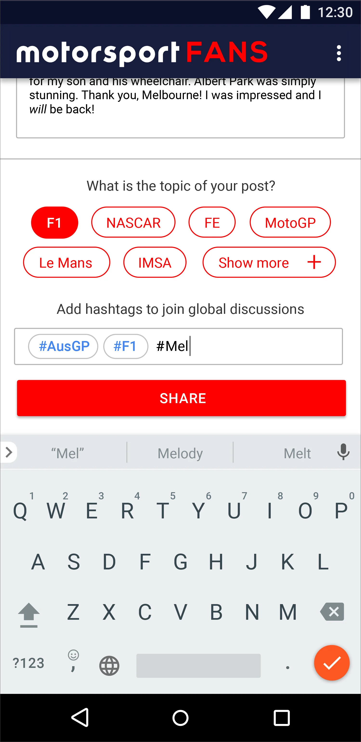
Screen 3: Choosing the Topic/Tags #️⃣
When users scroll down or expand a section, the switch between the types of content (text, audio, video…) will disappear. If they scroll up or collapse a section, it quickly returns.
Users must choose from one of the mentioned topics (and they can chose “show more” for lesser popular ones). Research should be done in order to make sure the most popular topics are visible right from the start.
With tags, on the other hand, users can be more specific and can input their own words or phrases. Since I believe typing “#” before every tag is so tiresome, I would like to try a new method of just pressing the space bar after typing a tag and a “#” will automatically appear in an empty tag bubble to help you make your next tag a little faster.
Screen 4: Completed Entry ✅
This is an example of how the screen would look right before the users tap “share” and publish their entry.


